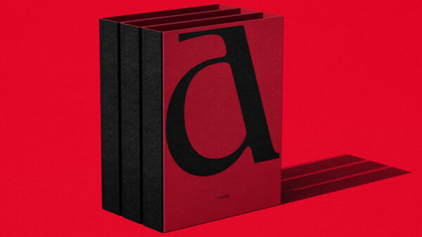
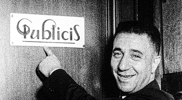
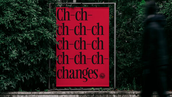
In 1926, Marcel Bleustein-Blanchet carved a few bold strokes into a door in France. It was the first mark of Publicis—a brand built on the idea that change isn’t something to react to, but something to lead. Nearly a century later, those original marks inspired a radical new typography system for Publicis Toronto’s new visual identity—one that merges the past with the present to create something truly new.
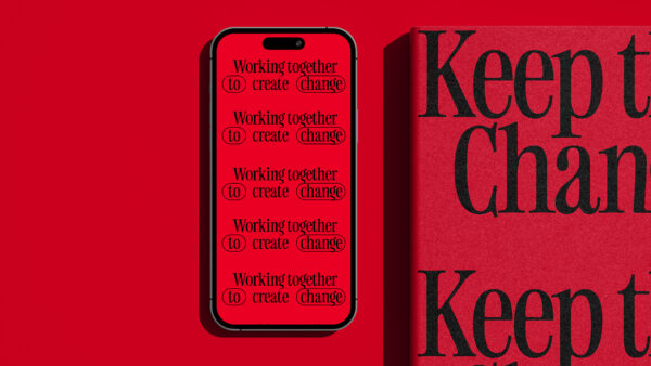
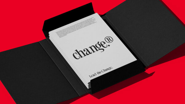
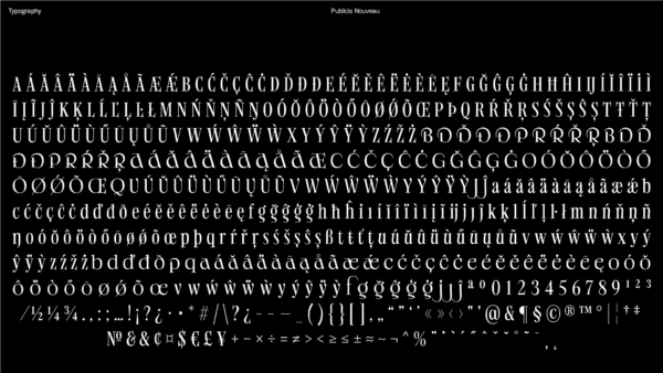
Publicis Toronto engaged its entire team in the process, blending Marcel’s original letterforms with their unique typographic strokes. This fusion—spanning nearly 100 years—did more than create a font. It created a living, breathing visual identity that embodies the agency’s founding belief: to lead the change.