Table of Contents
- Choosing the right images: how to pick your best stuff
- Preparing the basics: how to write an artist statement
- Showcasing your work: create an online portfolio
- Researching beforehand: what to look for in a platform
- Submitting your work: how to reach out
- Getting comfortable with rejection: try and try again
- Where to submit: the best websites and magazines for art + illustration
It’s tempting to approach the submission process like a numbers game and just start sending out as many images as possible to as many outlets as possible as soon as possible. But it’s important that you take the time to prepare some very basic things ahead of time so that following through on opportunities as they come goes smoothly.
Most sites have size requirements for images that are posted online versus printed in a physical format. Our site, for example, requires all images be a minimum of 1200px wide for online features. When it comes to our books, we require higher resolution images that depend on the specific dimensions of each publication. We also ask for a brief bio and project description (if submitting a series) or artist statement (if submitting a broad selection from your portfolio). Having these things on hand well in advance will give you the best chance to have your work properly reviewed, and also help streamline the initial back and forth once things get rolling.
Choosing the right images
You’d be surprised by the amount of artists who make a lot of good work but have no idea which pieces are their best. This is especially true of emerging artists who haven’t yet settled on their personal “style.” It may seem simple enough to choose a small number of images that are specific to an open call with a set theme. However, some basic questions to ask yourself are: Does this work demonstrate your technical skill? Is it well documented? Does it speak to who you are as an artist? Where does it fit within the aesthetic of the outlet or magazine you’re submitting to?
I would also add a final consideration: Does it have Punctum?
Punctum is a term used by French theorist Roland Barthes to refer to an incidental detail in a photograph that ‘pierces’ or ‘pricks’ the viewer. What exactly it evokes may be deeply personal and hard to explain. But it’s basically like an “X” factor – something that is there within the piece, that you feel on a visceral level, almost like a gut feeling. Once you’ve determined the technicalities are in order, it’s worth considering whether there’s something like that in there as well. Something, however small or seemingly inconsequential, that sparks an interest — hooks you and draws you in.
If you have trouble identifying your strongest work, consider asking for honest feedback from a friend or someone you respect. Do not ask someone who will only tell you everything looks great. These type of exercises may feel uncomfortably but are extremely helpful.
Preparing the basics
An artist statement is a short paragraph that tells people what you do and why you do it. If writing is not your strong suit, there’s no harm in keeping this very brief and factual. There’s no need to be fancy or long-winded. The most important thing is that this statement serves its purpose – which is to provide whatever additional context is needed to help someone who doesn’t know anything about you to appreciate your work or better understand it.
In terms of biographical information, you can limit this to where you’re from and if that is different from where you’re currently based, mention that too. Including your education (where you studied) is fine but not necessary. If you have no formal training, just jump right into what inspired your artistic journey or what you’re passionate about. This is what matters. This is where you need to think about how you want to present yourself. What makes you special as an artist? Is it your choice of subjects, your perspective, or your approach? Who are you not just as an artist but as a person — what is meaningful to you?
Showcasing your work
You want to make it easy for anyone to view your portfolio. Period. Most outlets will not download a giant zip file of hi res images of all of your work right off the bat. This is why you need to have an online portfolio that is easy to share and just as easy to access/view. Even if you’re submitting something specific for a themed open call, the person reviewing your submission may want to see more and you’ll want to have something that doesn’t require a whole series of emails or attachments.
A personal website is great. Instagram is just fine too if it is a showcase of your work. No matter your personal stance on Instagram or social media, the benefit of such platforms is that they are widely recognizable and easy to navigate. They’re simple enough to include your handle as part of your email signature/sign off. Although an important tip if using something like Instagram: make sure that your work is the focus. Create a separate Instagram account that is distinct from your personal photos if you have to. Then double or triple check that your account is public. No one will bother to make a follow request. You want this process to be as seamless as possible for the person reviewing your work.
Researching where to submit
It’s easy to say “know your audience” but what does that actually mean? To put it very bluntly, follow their social media and stalk their accounts. I’m talking scrolling through at least the last few months of content. This will help you get a sense of not just how often they post/feature new work but what their specific style is and whether you would fit in.
Doing this will also give you an idea of what your “chances” are by providing you with information like whether they tend toward emerging artists or more established ones, how polished or fully fledged featured projects tend to be etc. This doesn’t mean your work needs to look exactly the same as what they have featured in the past. (Sometimes it can be a good thing if what you’re offering is filling a gap in their content or is a style they clearly like but haven’t been featuring much lately). What you’re aiming for here is a sense of expectation — figuring out what they may expect from you and managing your own expectations.
Spending time on these sites is also good practice for reflecting on your own preferences and determining whether your taste even aligns with a particular platform. Do they feature work you think is good? Would you be excited to have your work accepted by them? This may also help you solidify your personal style (if that’s something you’re still struggling with) — how does your work compare? What does your work offer that is unique to you?
Making a submission
Galleries and magazines, both online and in print, get a flood of art submissions every single day. This doesn’t mean you need to wrack your brain coming up with a unique way to approach them that will set you apart. You’re operating with a visual medium. To a certain extent, your work can and should speak for itself. Going all out on a grand gesture, especially in a written format like an email, isn’t the way to go. So before you hit that submit button, take a moment to review your materials and, especially with regard to any written components, ask yourself if everything is there that needs to be. Don’t say more than you need to. That being said, don’t be too casual either. Sliding into a gallery’s DMs, isn’t the way to go either.
Approach them on their terms and when they’re the most receptive to being approached. Sites like ours are often very explicit about how they prefer to receive and review submissions. We have our own submission form. Other sites may provide a dedicated email address. The art of crafting the perfect cold email is a subject matter unto itself. But similar to our advice about artist statements, you can’t really go wrong with keeping things brief and to the point. And including a link to your easy-to-view, online portfolio (as discussed above) will ensure that if they’re interested in seeing more than the x amount of images you provided, they can!
Getting used to rejection
If you’re told to keep trying, actually try again! Rejection is hard. Yes. But what should be even harder to accept is the idea of genuinely talented people giving up based on a misunderstanding of what a single rejection means. While it’s important to self-reflect and be open to learning and growing from feedback, it’s just as important to accept that when someone says “this isn’t a fit this time around” they mean exactly that!
Realise that you may have been rejected for reasons that have little to do with what you assume the reason to be. While we put a lot of ourselves into the things we create, it’s important to allow some distance for this side of the process and try not take things too personally. The piece you submitted may not have matched with the vision they had for this particular exhibition or publication for any number of reasons, it does not necessarily mean the work is bad. Consider how many people were going to be selected. If there were going to be five artists chosen from 500 submissions, a lot of great work was not selected. Especially in this day and age when it’s more common to hear nothing back at all, if you’re encouraged to try again, take that response to heart.
Where to submit
There are a lot of opportunities to submit your work online. But, as we said at the start, this is not just a numbers game. There are loads of spots for almost every kind of art imaginable, but they’re not all the same. It’s not about getting published anywhere; it’s just as much about where you want to be seen and by whom. Each platform has advantages and disadvantages based on their own tastes, audience, and viewership so it’s worth taking the time to get a feel for what’s out there.
We’ve compiled a collection of globally recognized blogs and magazines that exclusively feature fresh, creative endeavours and currently welcome online artwork submissions. These are what we consider to be the prime destinations for emerging artists. Even if you’re not prepared to submit at this very moment, you might stumble upon a few sites worth keeping in mind as a goal to work toward as you continue to build up your portfolio.
Our Curated List of Websites Open to Submissions for Art + Illustration
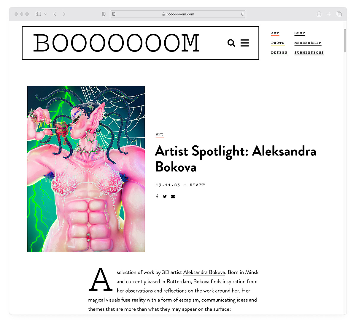
Website: booooooom.com
Instagram: @booooooom
Types of Artwork: Fine Art, Illustration, Graphic Design, Street Art, Photography, New Media, Sculpture
Click here to submit!
Not that this list is in any particular order but Booooooom has been one of the leading global art platforms on the internet for over 15 years now. It is an authority in the new contemporary arts scene, highlighting emerging talent and building a community of artists and art-enthusiasts and publishing art and photo books. While we set up a number of open calls for contests and publications throughout the year, we encourage our members to submit their work on a regular basis for spotlights on our site/socials and newsletter features!
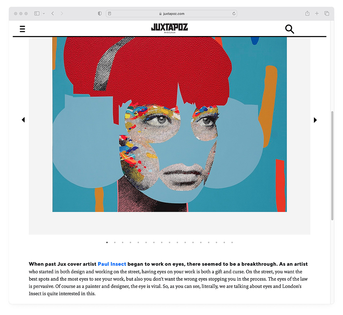
Website: juxtapoz.com
Instagram: @juxtapozmag
Types of Artwork: Painting, Illustration, Street Art, Sculpture
Click here to submit!
Established in 1994, Juxtapoz is an arts and culture magazine that celebrates alternative and underground contemporary art. Working to bridge the gap between unconventional art styles like graffiti and street art with more established ones, Juxtapoz tends to highlight work that challenges traditional distinctions of high and low art, embracing work that pushes the boundaries of contemporary art.
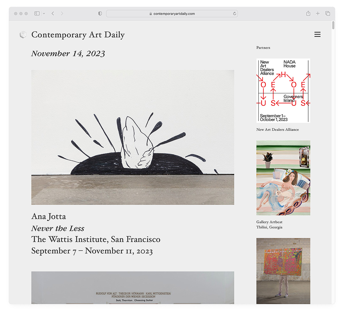
Website: contemporaryartdaily.com
Instagram: @c.a.daily
Types of Artwork: painting, fine art, sculpture, installation, performance
Click here to submit!
Founded in 2008, Contemporary Art Daily is based on a simple premise: to showcase documentation of at least one current exhibition every day. Since then, it has formed a non-profit organization and built on this work. The Contemporary Art Library is the result of 12 years of publishing and all the documentation turned into a broad archive of contemporary art.
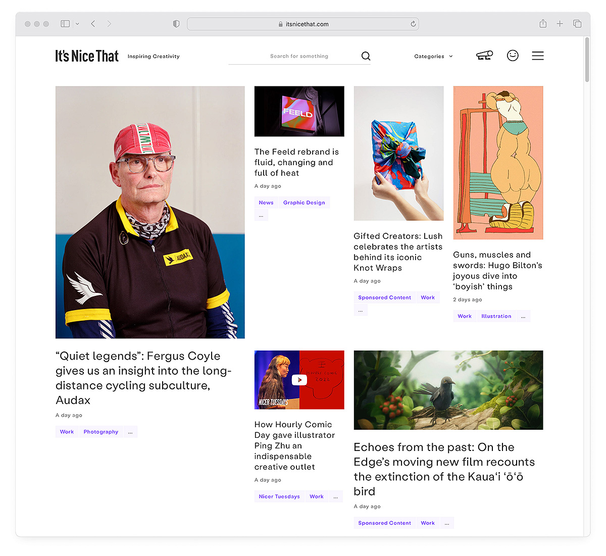
Website: itsnicethat.com
Instagram: @itsnicethat
Types of Artwork: Illustration, Graphic Design, Painting, Fine Art, Photography, Branding
Click here to submit!
It’s Nice That is always sharing interesting work from all around the world. From students preparing to join the industry to leading creative thinkers, they want to open this world up to the widest possible audience. Send them your work via email and then go watch some of their Nicer Tuesdays creative talk videos.
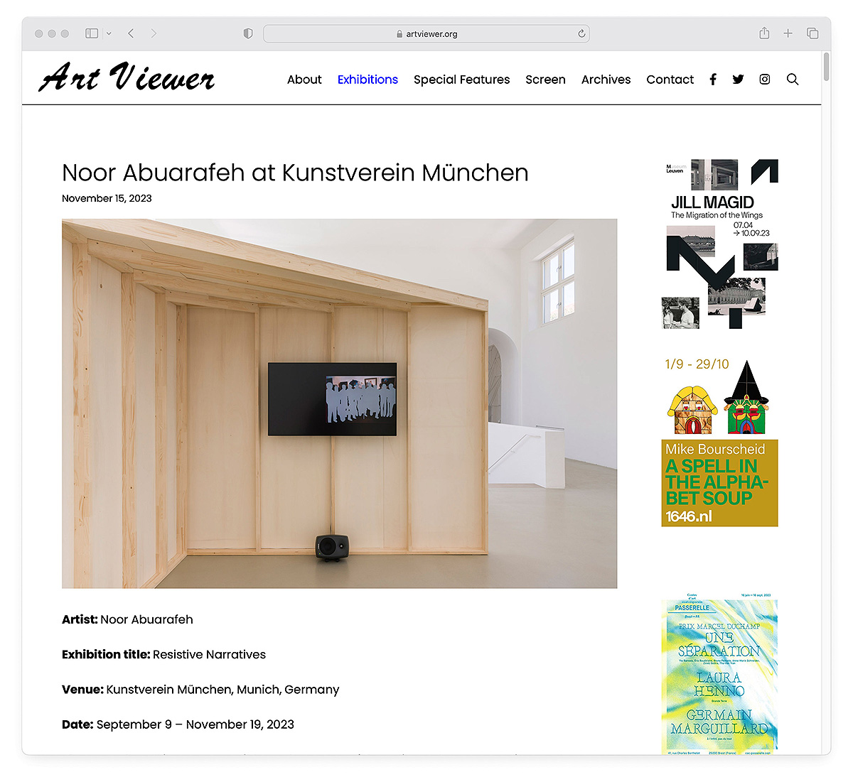
Website: artviewer.org
Instagram: @art.viewer
Type of Artwork: painting, sculpture, installation, film/video
Email submission to: submissions@artviewer.org
Art Viewer is a non-profit organization and artist initiative based in Antwerp, Belgium. It promotes contemporary art through the curated documentation of art exhibitions and events. Their mission is to create and advance a comprehensive archive of contemporary art. The platform showcases documentation from exhibitions around the world as well as in-depth features on specific artists, curators, and venues specific to contemporary art.
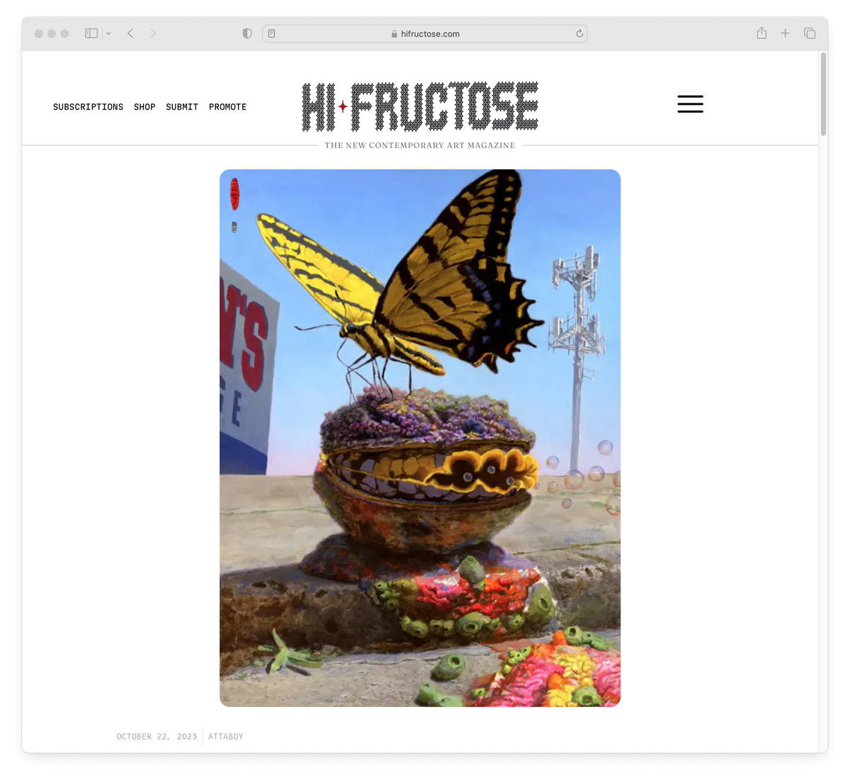
Website: hifructose.com
Instagram: @hifructosemag
Types of Artwork: street art, illustration, sculpture, contemporary craft
Click here to submit!
Hi-Fructose magazine was started in 2005 by artists Attaboy and Annie Owens as a quarterly print art magazine. It has a very lowbrow pop surrealist aesthetic and features a mix of new and established artists.
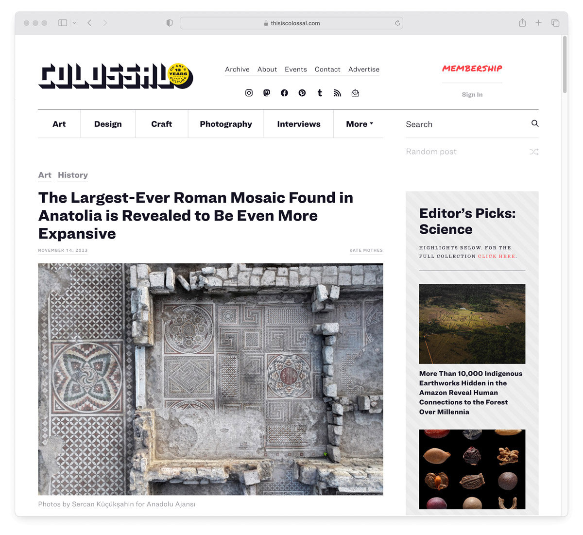
Website: thisiscolossal.com
Instagram: @colossal
Types of Artwork: Fine Art, Design, Modern Craft, Street Art, Photography, Illustration, Sculpture
Click here to submit!
Colossal is a lot more broad than some of the others on this list. You may find everything from origami to architecture here—as long as it’s eye-catching. Founded in 2010 by writer and curator Christopher Jobson, Colossal is an online gallery of visually stimulating articles that seeks to educate and entertain. The content spans a diverse range of artistic fields and art forms but the one thing they all have in common is their features usually have a magnitude or larger-than-life, wow factor.
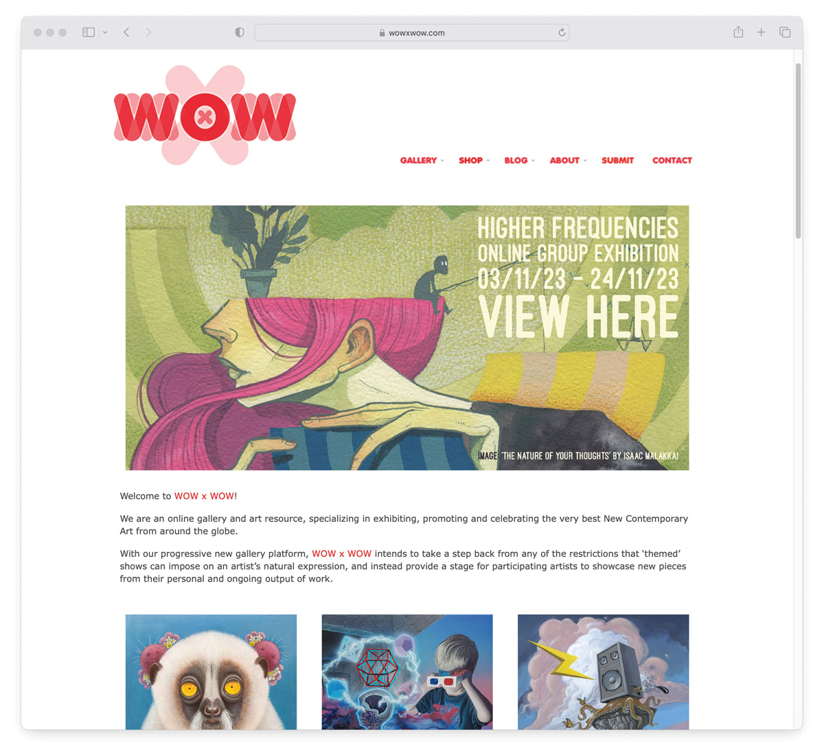
Website: wowxwow.com
Instagram: @wowxwow_art
Type of Artwork: fine art, illustration, graphic design, street art
Click here to submit!
WOW x WOW is a UK based online gallery and art resource that specializes in exhibiting, promoting, and celebrating the best New Contemporary Art from around the world. It was started in 2014 by Scottish artist Tim Maclean with the aim of highlighting and supporting emerging and mid-career artists whose work blurs the boundaries between fine art, illustration, graphic design and street art. As sole curator, Maclean’s personal taste tends to lean toward artwork that contains a strong narrative, elevated level of technical skill, unique aesthetic and surrealist slant.
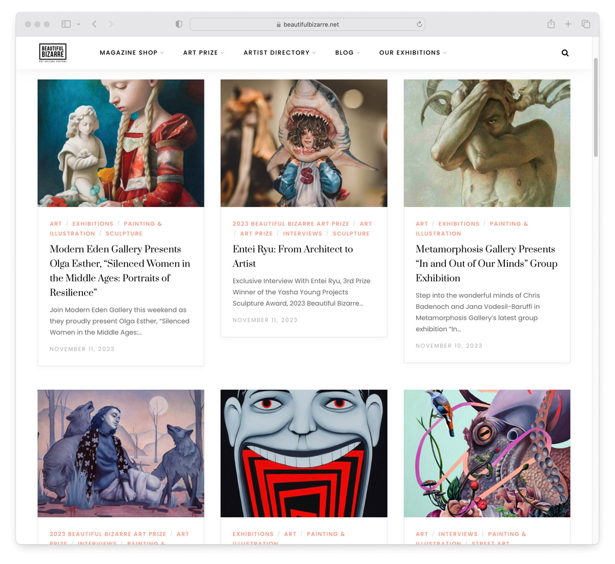
Website: beautifulbizarre.net
Instagram: @beautifulbizarremagazine
Type of Artwork: painting, illustration, street art
Click here to submit!
Based in Australia, Beautiful Bizarre features work by local Australian artists as well as emerging and mid-career artists from around the world. The style here is primarily pop surrealism.
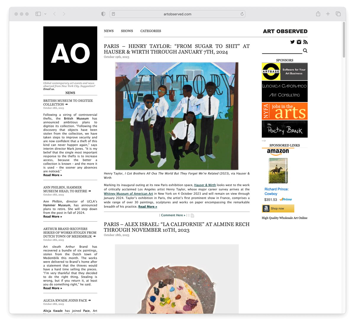
Website: artobserved.com
Instagram: @artobserved
Type of Artwork: painting, sculpture, installation
Email submissions to: info@artobserved.com
Founded in 2009, Art Observed covers international contemporary and fine art news from a New York City perspective. Its intention is to provide a curated perspective on the fine art arena that includes the trends and forces that drive the market today. The selection of work presented here leans slightly more on the traditional, fine art side of things compared to some of the other sites on this list in terms of gallery-style presentations and installations of works.
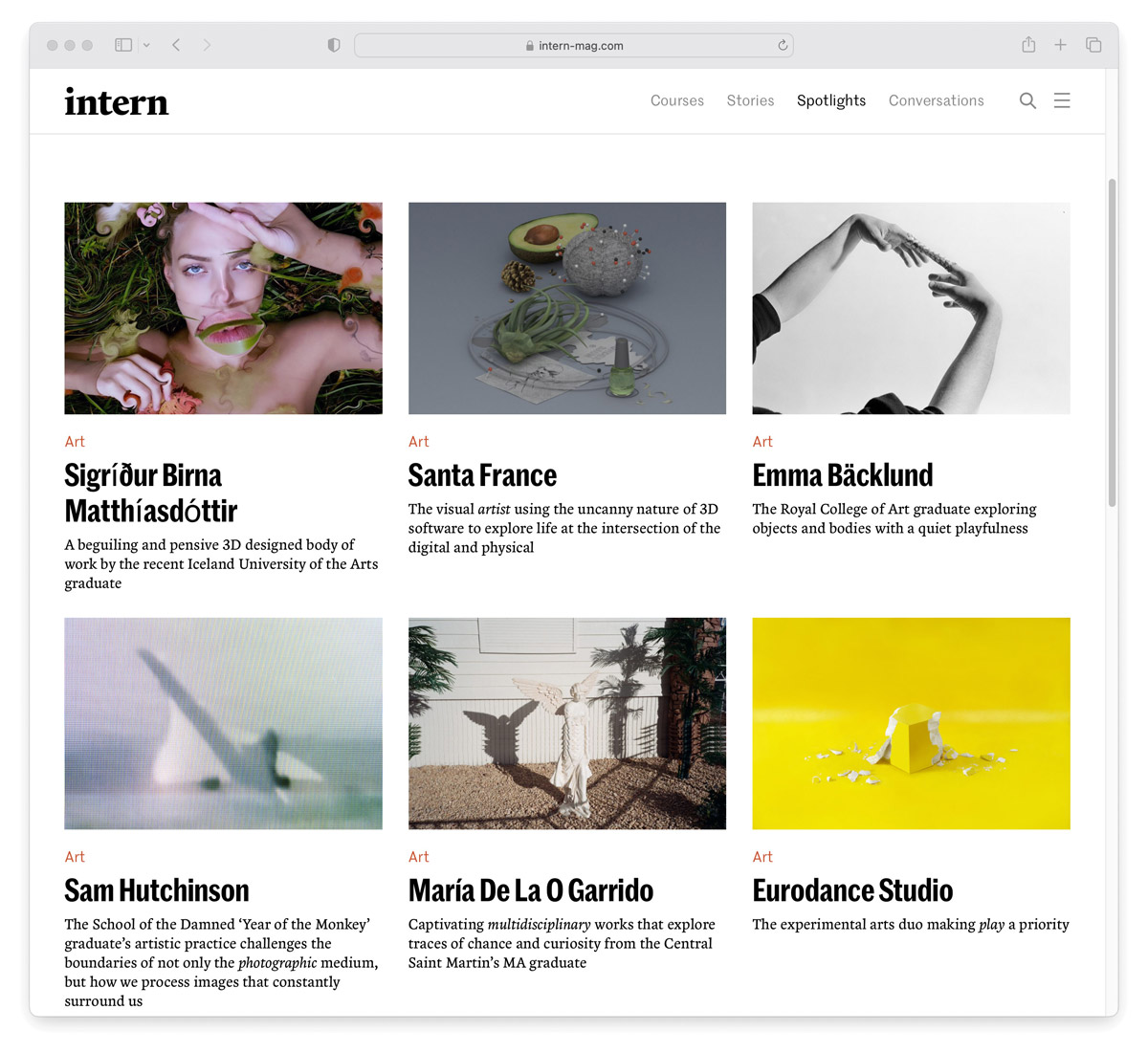
Website: intern-mag.com
Instagram: @thisisintern
Type of Artwork: illustration, graphic design, art, photography
Click here to submit!
Focused on empowering the next generation of creatives journeying toward the careers of their dreams, Intern is an independent print publication dedicated to challenging the damaging status quo too often faced by those just starting out in their chosen field. They launched in 2013 as a way of providing a space for frank discussions about the difficulty of breaking into creative industries, offering support for emerging artists, students, and recent graduates through career-focused resources, online courses – tips and insight. They also have a “Spotlights” section dedicated to showcasing emerging creatives and their work.
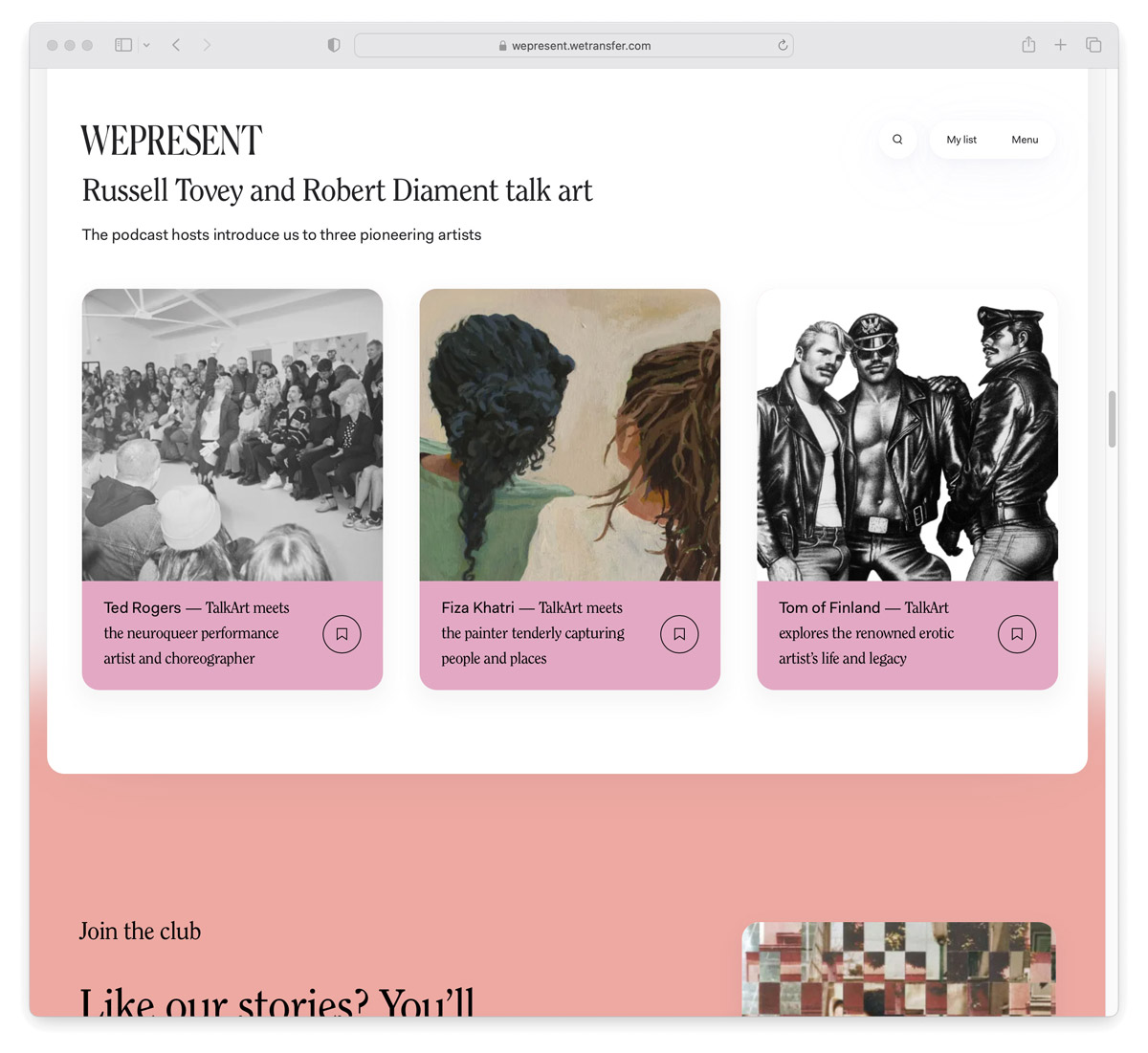
Website: wepresent.wetransfer.com
Instagram: @wepresent
Type of Artwork: fine art, illustration, design, music, film, literature
Email submissions to: ideas@wetransfer.com
WePresent is WeTransfer’s digital arts platform. It began as a blog to better showcase the artists commissioned to make WeTransfer wallpapers. It has now turned into a specially-designed site for larger artistic collaborations. The platform is all about sharing the weird, wonderful, and unexpected sides of creativity through stories and artist endeavors in the hopes of further inspiring others. They are particularly invested in projects that span diverse communities – whether its age, race, geography, gender, sexuality – WePresent believes “more voices equals better ideas” and are on a mission to be the most representative creative site on the internet.
Join our Secret Email Club
Our weekly newsletter filled with interesting links, open call announcements, and a whole lot of stuff that we don’t post on Booooooom! You might like it!
Sign UpRelated Articles
