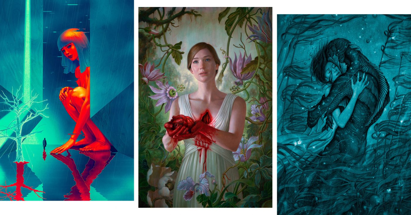
Hollywood has James Jean on speed-dial these days. The Los Angeles-based artist has created film posters for three of this year’s biggest films—mother!, The Shape of Water, and most recently Blade Runner 2049. The opportunity to work on a project helmed by a visionary director like Darren Aronofsky, Guillermo del Toro or Denis Villeneuve would be the cherry for many illustrators, but all three? We spoke with James Jean about his experiences creating visuals for a trio of dream projects.
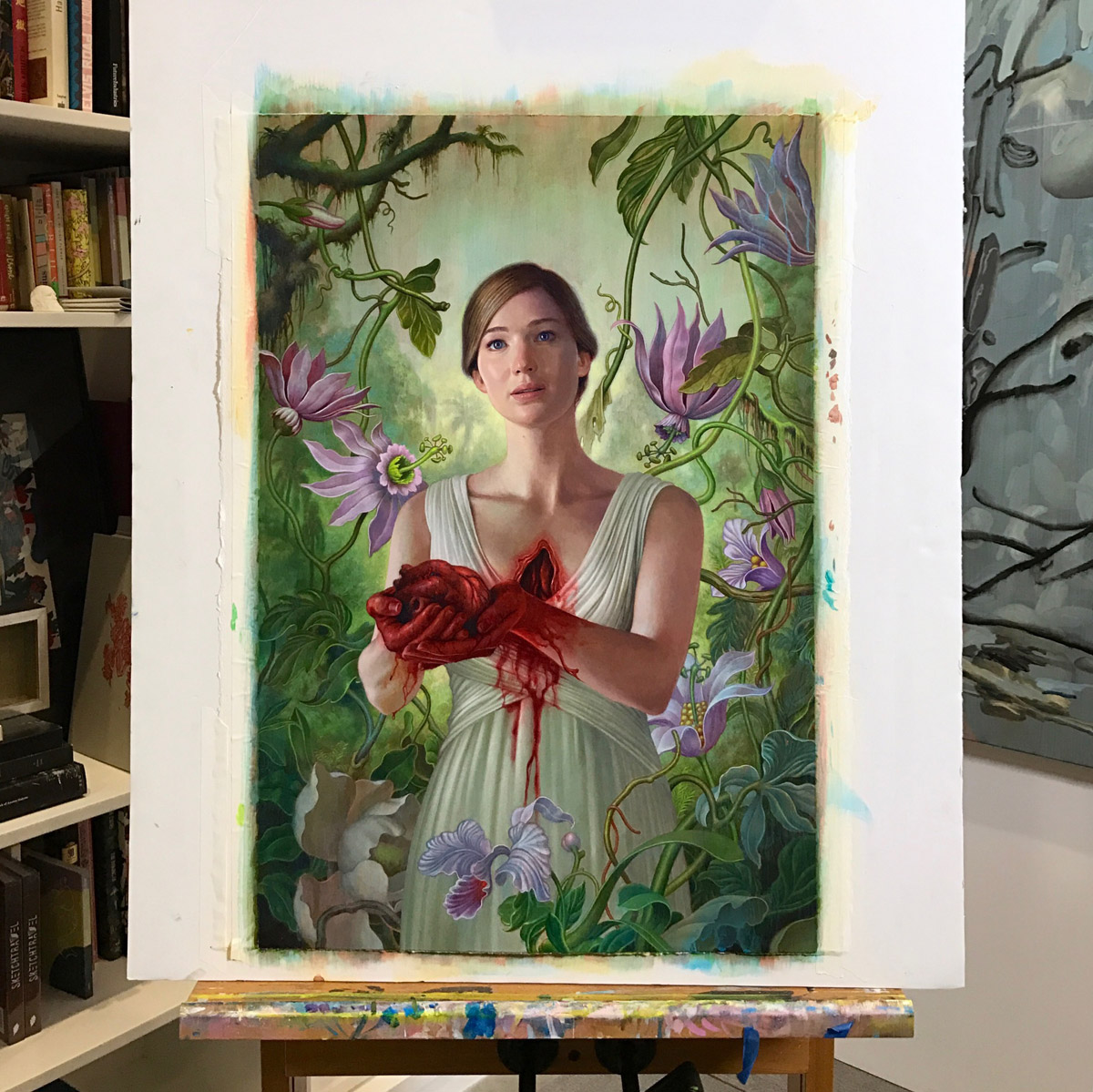
Work in progress: James Jean’s painting of Jennifer Lawrence for the mother! film poster
Jeff Hamada: How did you suddenly become Hollywood’s go-to artist for film posters?
James Jean: I’m not sure how I got so lucky. What’s interesting is that each request happened independently of one another and around the same time – it wasn’t as if I was hired because the director saw a previous poster I had done. In fact, I had not done any official movie posters before. There must have been a confluence of factors that lead them to think of me, a mentalist’s string of subliminal hints that influenced these visionary directors to choose me to interpret possibly the most significant films of this year.
One factor might be the rise in popularity of alternative collectible movie posters these past 10 years or so. Darren called me directly and Guillermo slid into my dm’s, and both were working on films that were intensely personal and meaningful. The marketing people at Warner Bros. contacted me about Blade Runner 2049 a little later on, which is still kind of amazing because I was harboring this fantasy of doing a poster for them ever since the movie was announced.
Jeff Hamada: You kinda jokingly called this a trilogy but something tells me there will be more. What’s next? I’d love to see you do a poster for The Killing of a Sacred Deer. The film looks insane.
James Jean: Yeah, I really liked The Lobster so I’m very keen to see the Sacred Deer when it comes out. The reason why I probably won’t do any more posters this year is because I’m busy working on my next solo show at Kaikai Kiki Gallery in Tokyo. Also, it’s hard to top Aronofsky, Del Toro, and Villeneuve, all in one season.
Jeff Hamada: Yeah pretty tough! I know you got the script for mother! and actually screened The Shape of Water, but Blade Runner was the only one where you weren’t given much information. Was it difficult to work blind like that?
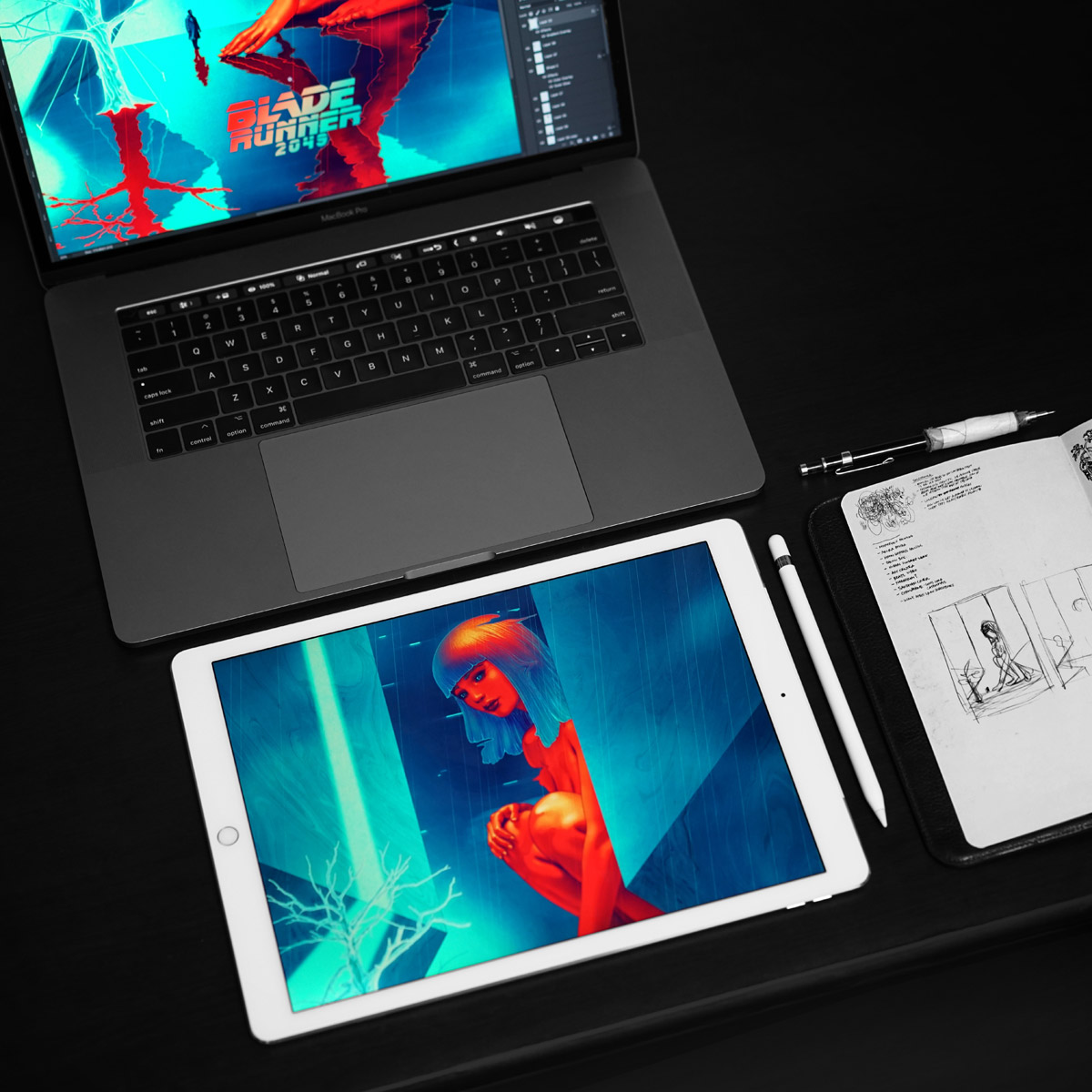
James Jean working on poster for Blade Runner 2049
James Jean: Yes, it was pretty difficult . . . they did want to screen the movie for me, but I was going to be in Japan at the time so it didn’t work out. So, I tried my best to form an understanding of the movie not only from all the existing marketing material and interviews given at the time, but from Denis’ previous work as well. Using analysis of his previous films and the themes from the original Blade Runner, I sort of created my own predictive script of the sequel. I pretty much had full creative freedom, but they did want me to incorporate the teal/red color palette from their campaign.
Jeff Hamada: I saw that Darren Aronofsky was quoted on the French edition of your book, Rebus. You guys BFFs now or what?
James Jean: Ha! That quote was in the original US version of the book also. I had created paintings for these art shows that Darren had put together for The Fountain and Noah, so we have a little bit of history. Guillermo also contributed a quote to another book of mine as well.
Jeff Hamada: You mentioned he had a different idea for the mother! poster originally, what was that? Can you walk through some of the initial ideas/sketches you had for visualizing each film, and how each became the final product?
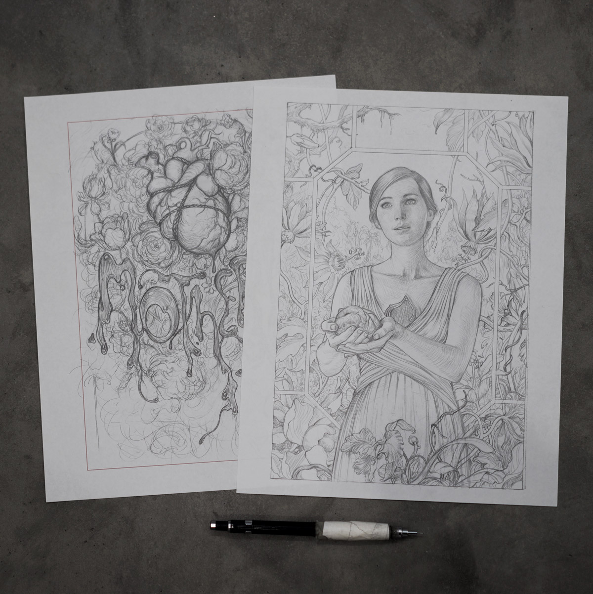
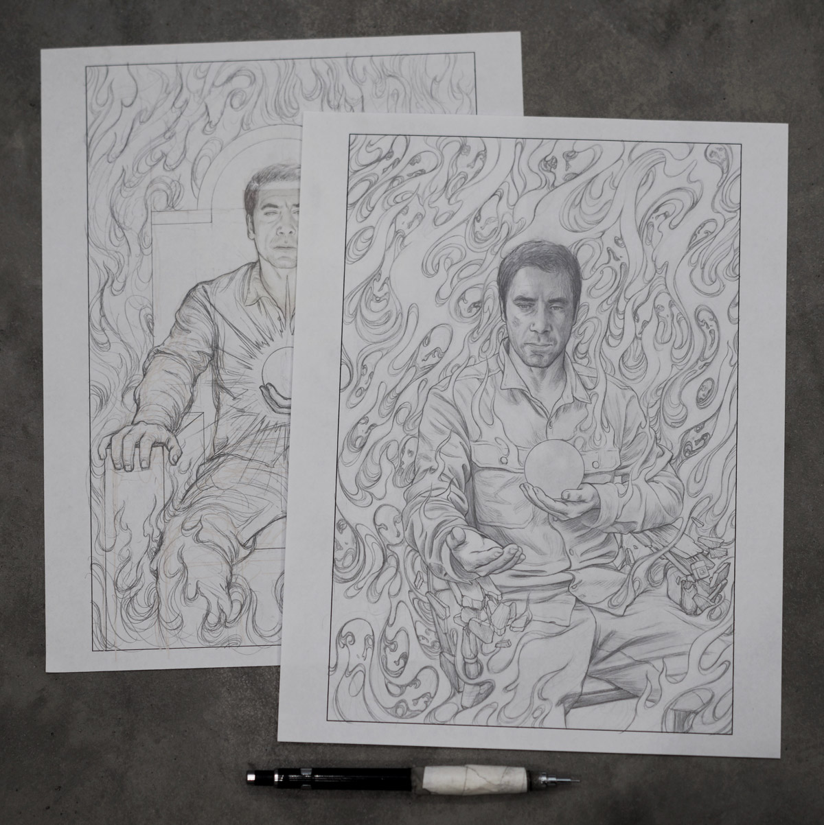
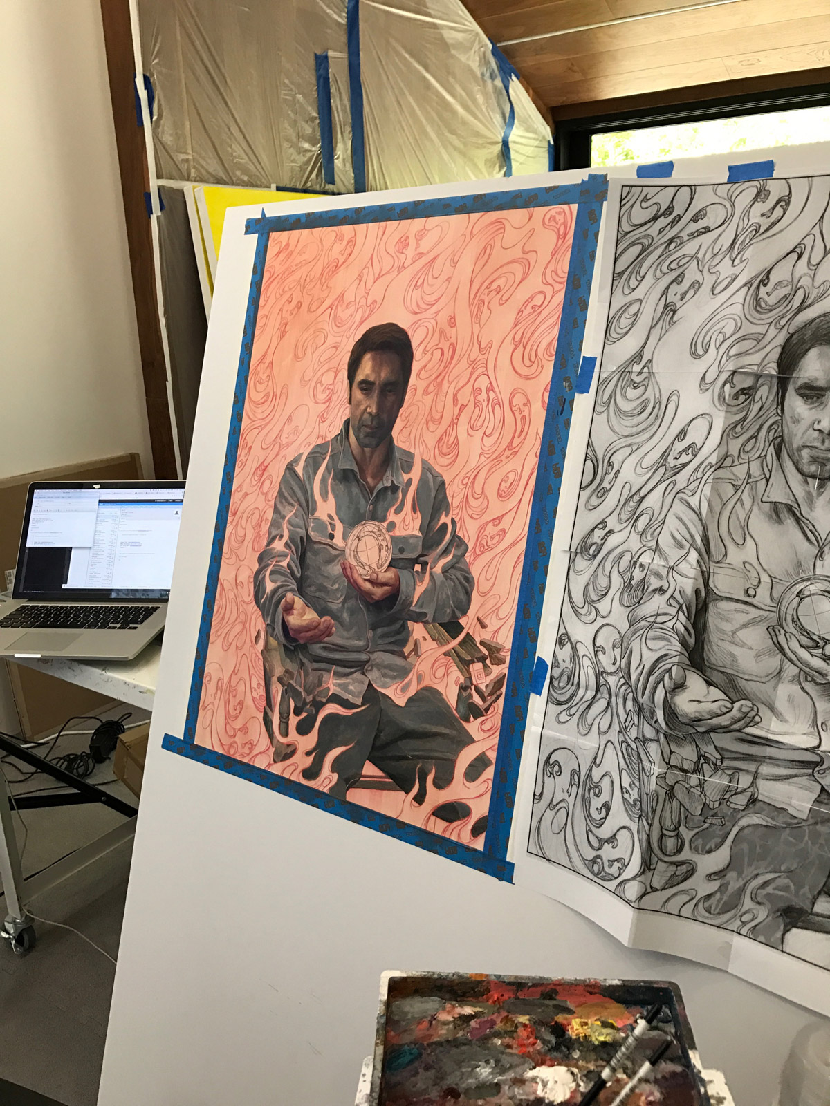
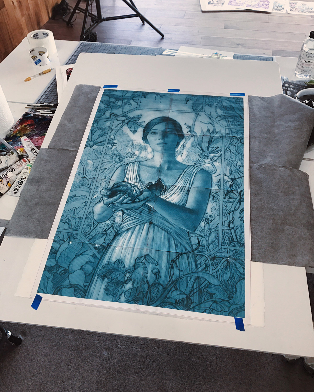
James Jean: Darren had a couple of different ideas, but fundamentally it was about how to express this idea of gore contaminating a beautiful, verdant environment. After some discussion, he sent through a picture of a sculpture by Jessica Harrison of a porcelain girl taking her heart out of the chest. From there the idea clarified and we went through a lot of sketches and worked through a lot of different details to hit the right tone. I had the idea to add a bunch of Easter eggs in the painting since the vegetation and composition provided ample opportunity to hide things throughout, and Darren provided guidance as to what to include. At one point, he said his friend David Blaine suggested that we hide some writing in the dress, and that’s turned out to be the most successful Easter egg as it’s been the hardest to identify and yet it’s in the most prominent location.
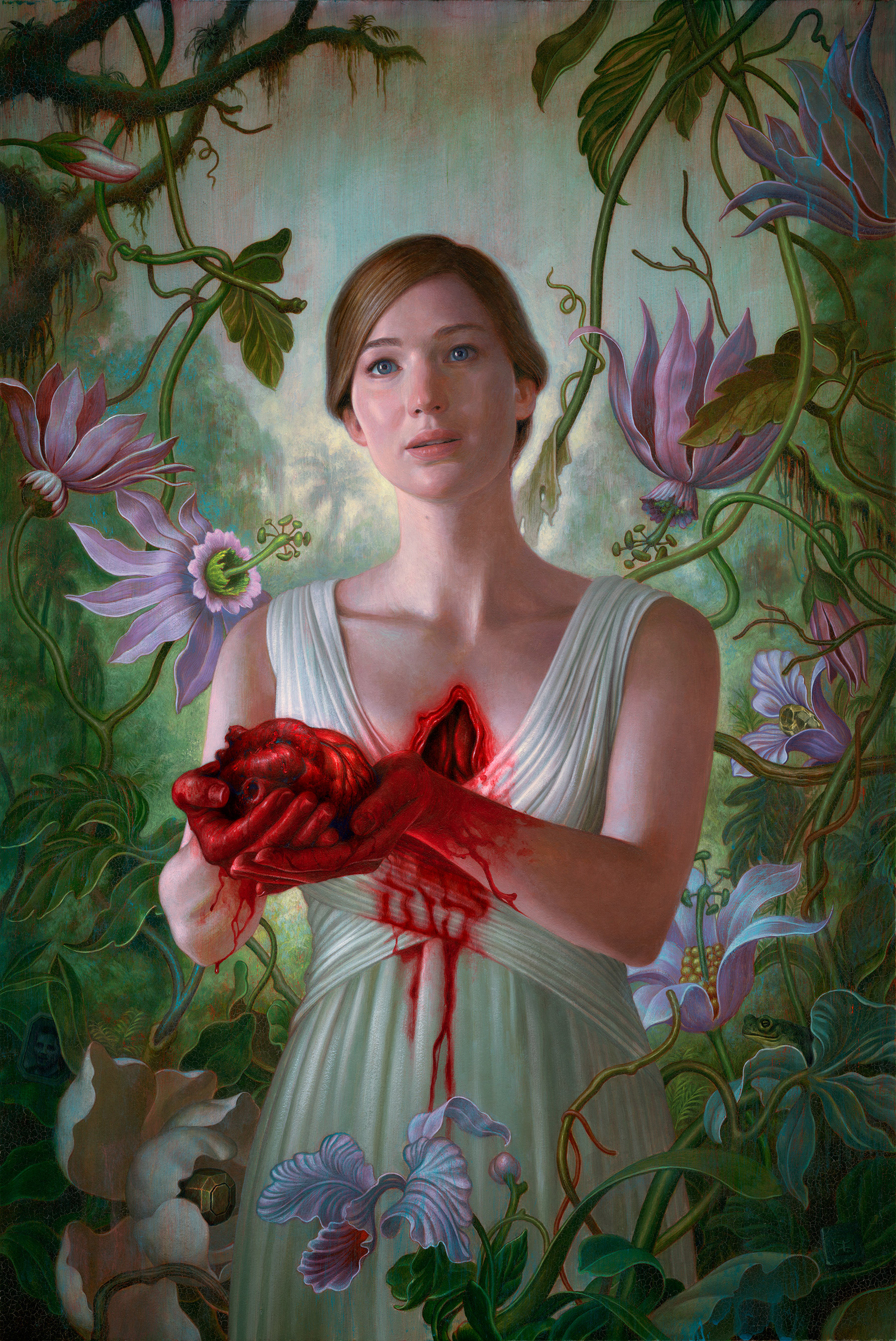
Finished poster for mother! by James Jean (can you see the easter eggs hidden in the image?)
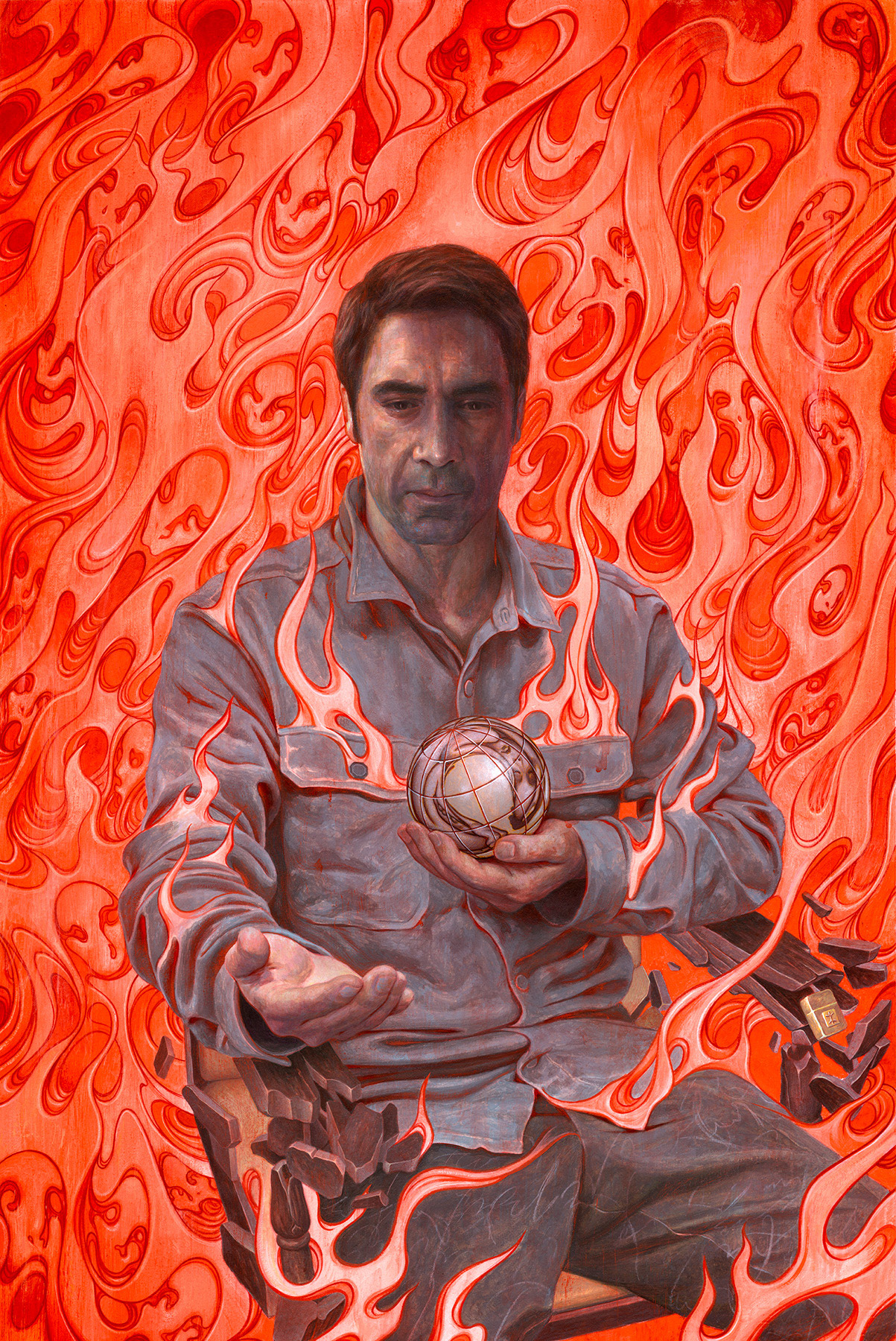
Finished poster for mother! by James Jean
James Jean: For The Shape of Water, Guillermo actually had a very simple idea – he drew a rough sketch, almost like a yin-yang symbol that was a simple representation of the woman and monster in a tight embrace, completing each other in form and spirit. So working from that basic idea, I had the characters cling to each other underwater while seaweed surged around them. Not only did I see the movie, but I had the benefit of reading some longer text that expanded on the story, so I felt that I had a good grasp of the tone and emotional foundation of the film. The film is full of great characters, themes and amazing imagery, but we wanted to keep the concept of the poster simple and pure.
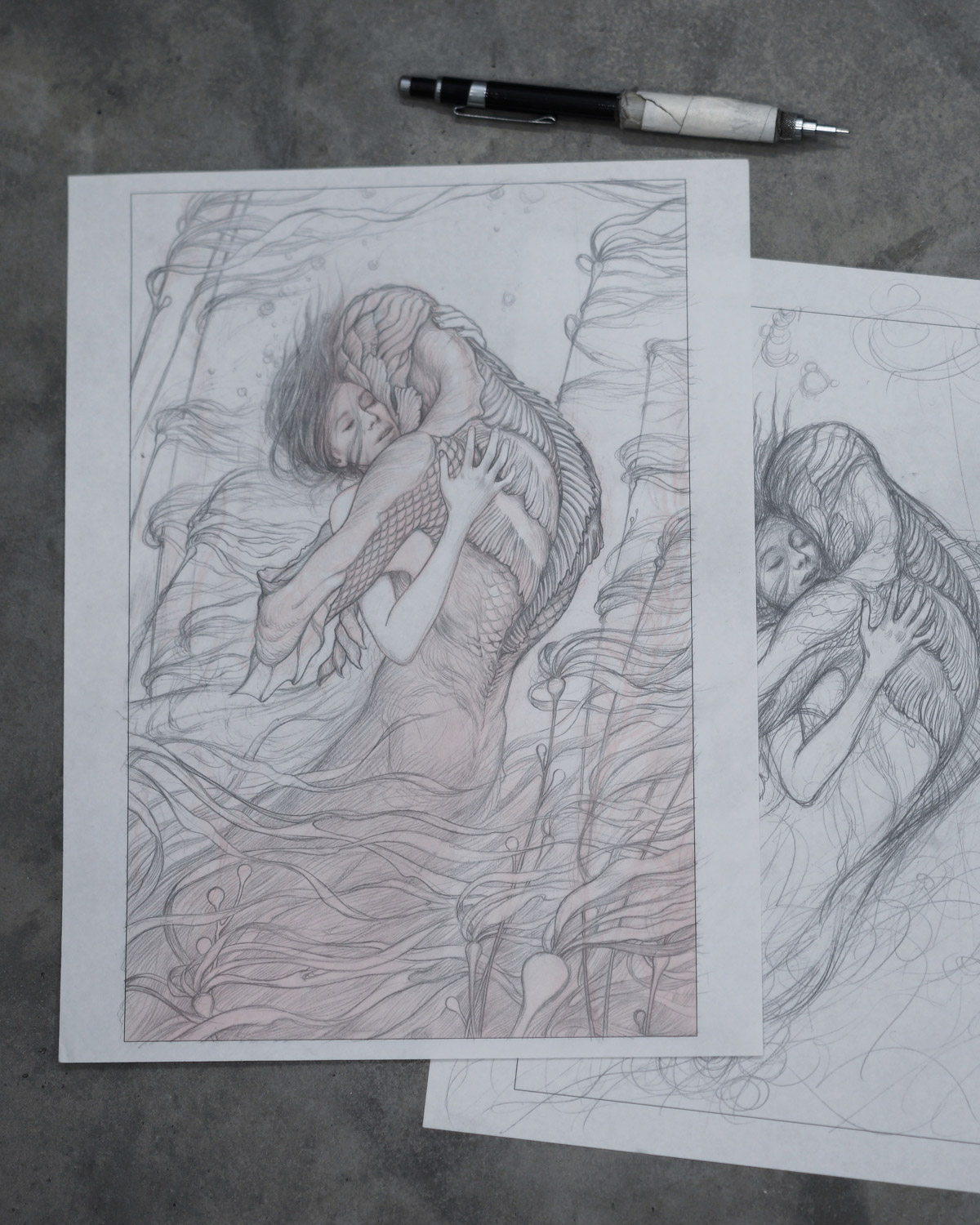
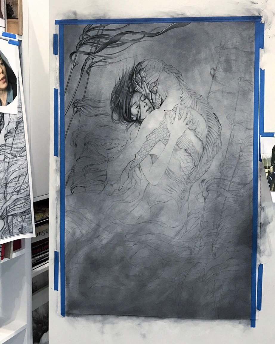
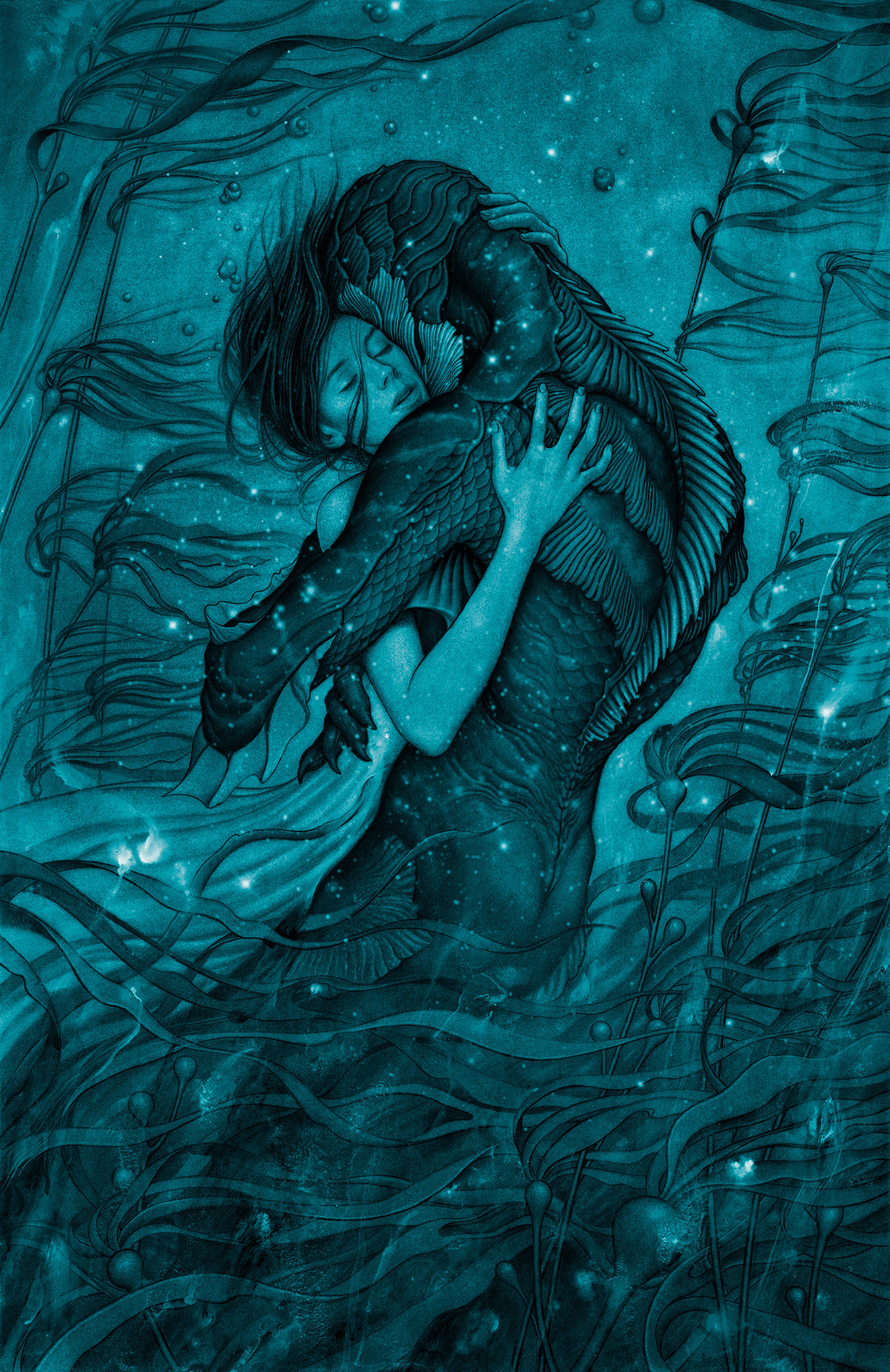
James Jean’s finished film poster for “The Shape of Water”
James Jean: In discussing Blade Runner 2049, the marketing people told me they wanted an image that would appeal to a broader audience. They liked the work I had done for Prada, and after reviewing the existing Blade Runner campaign, we agreed that a different approach could better evoke the mythological aspects and visual poetry of the movie, as opposed to the hard sci-fi that might turn away some potential viewers. So I took inspiration from the photography of Roger Deakins, the importance of light as a character in the film, the interplay of architecture and the natural world, the barren tree and the motif of water, the extreme scale of the characters as an exploration of humanity, and the reflection of the elements in the water as a meditation on these ideas. The color also becomes symbolic (the reflection of the tree as a circulatory system, the red of the girls flesh, the brutal blue of the architecture).
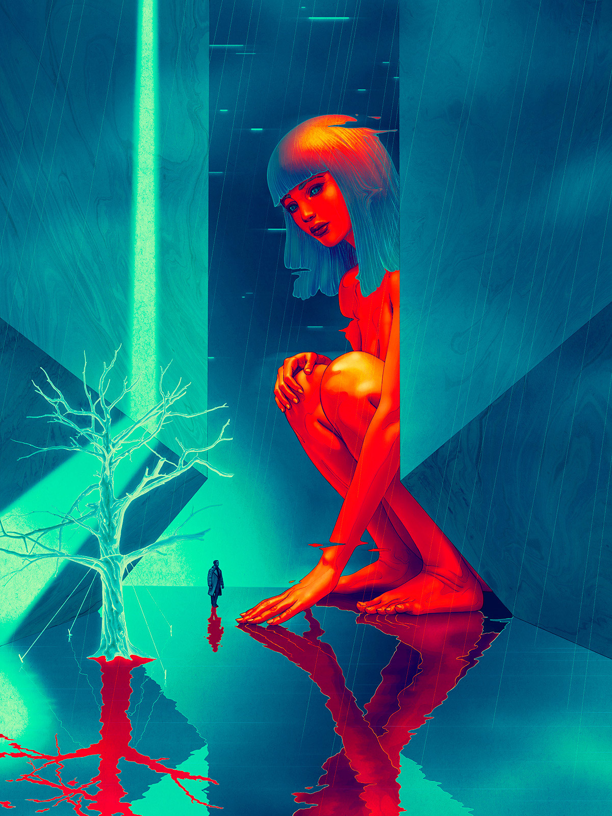
James Jean’s finished poster for Blade Runner 2049
Jeff Hamada: Did each of these start as a pencil sketch and finish digital? Or were any of them digital all the way?
James Jean: mother! and The Shape of Water began as pencil sketches but ended up becoming a painting and a charcoal drawing respectively. Blade Runner 2049 was digital all the way. During the process for Blade Runner, Warner Bros told me that Apple was interested in being involved with the campaign, so I pitched them the idea of creating the piece on the iPad Pro with Apple Pencil. Since I was involved with the launch of the Apple Pencil and iPad Pro in 2015, this seemed like an easy fit. I also asked the makers of Procreate, the app that I use on the iPad, to help me create time lapse videos for the project.
Jeff Hamada: I’m curious, which of these three directors’ work resonates with you the most?
James Jean: I can’t really choose one over the other, they each create work that resonates with a different part of me. Guillermo keeps sketchbooks that explore imaginary monstrous realms, Darren explores narratives of self-destruction and self-sabotage in the pursuit of creative perfection, and Denis has a more lyrical, restrained approach to the exploration of human nature. Consequently, each poster has a different look and were executed with different mediums, and I suppose they end up representing the range of my capabilities.
Jeff Hamada: What are some of your all-time favourite film posters?
James Jean: My neighbor in Los Angeles, Ernie Wolfe, put together a great book called Extreme Canvas: Hand-painted Movie Posters from Ghana. These posters are quite amazing with their distorted anatomy and transmogrification of famous films through an African lens. There was a lot of local competition to create the most garish, eye-popping posters, and thus we are left to enjoy these illustrations that are probably more interesting than the films themselves.
Jeff Hamada: You haven’t been posting stories on Instagram lately! I don’t mean video stories, I mean like text stories—like the one you posted about the “alien” at your door. This is unacceptable.
James Jean: Haha, yeah, some of those text stories got amazing responses. The photos functioned as both the inspiration for the stories and proof that they happened. But now that I’ve got a kid, I just don’t have the time anymore to craft these little stories. I barely have time enough time to paint these days. It’s not easy to maintain the pace and quality of work that I’ve become known for and still be a functioning human being.
Jeff Hamada: Have you ever thought about writing a script? Maybe you can do the next film poster as a trade—like “Yeah, I’ll do the poster if you read my script…”
James Jean: Well, I’d rather just do the poster to my own movie then!
Join our Secret Email Club
Our weekly newsletter filled with interesting links, open call announcements, and a whole lot of stuff that we don’t post on Booooooom! You might like it!
Sign UpRelated Articles
