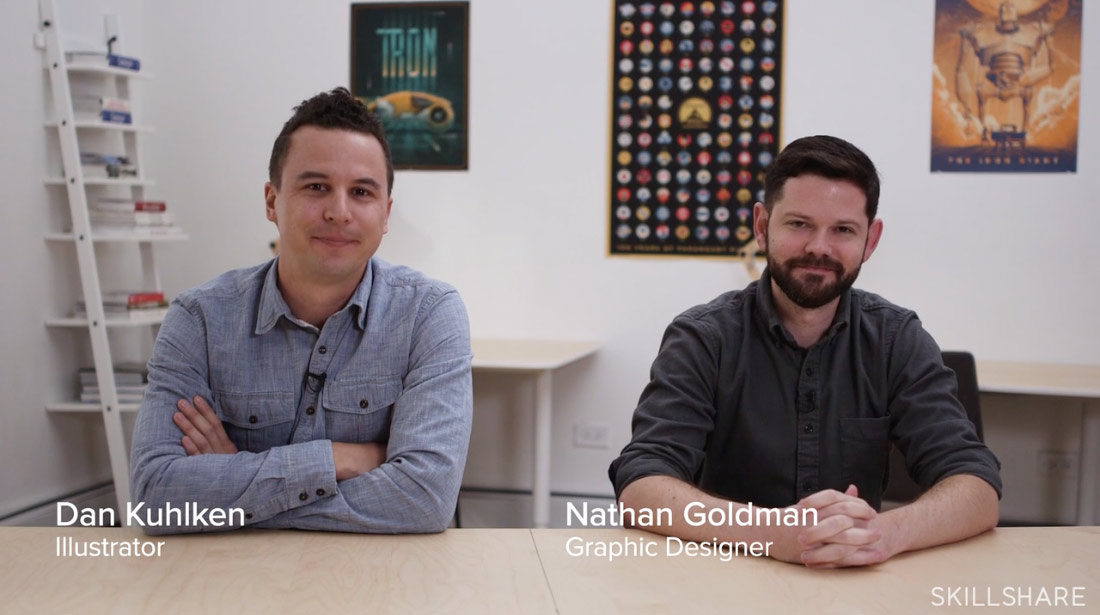
We’re partnering with Skillshare once again, to offer you guys access to thousands of quality art and design classes taught by award-winning creatives. A new Skillshare class has been released called Illustrating an Icon Set: Design a Cohesive Series, featuring illustrator Dan Kuhlken and designer Nathan Goldman of DKNG Studios. You may know them from their fantastic poster for Paramount’s 100th year Anniversary featuring 100 movies transformed into icons (check it out here).
Skillshare was interested in Booooooom sharing news of this class so I enrolled in it to make sure it was something worth your time. I’ve written a short review below and if you want to try it out, we have an exclusive offer for 2 free months of Skillshare Premium — just hit the link here!
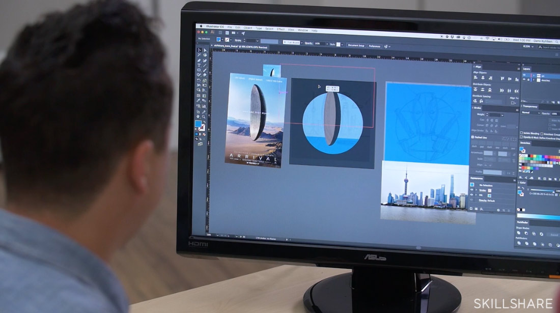
I’ll preface my review of this class by saying that despite having freelanced as a graphic designer for several years, most of my knowledge of Illustrator came from learning on my own (through trial and error). For every advanced thing that I figured out there were always a couple other basic things I didn’t, and it’s interesting to watch these lessons with a ‘swiss cheese’ knowledge of the program because they reveal so many more efficient ways of working.
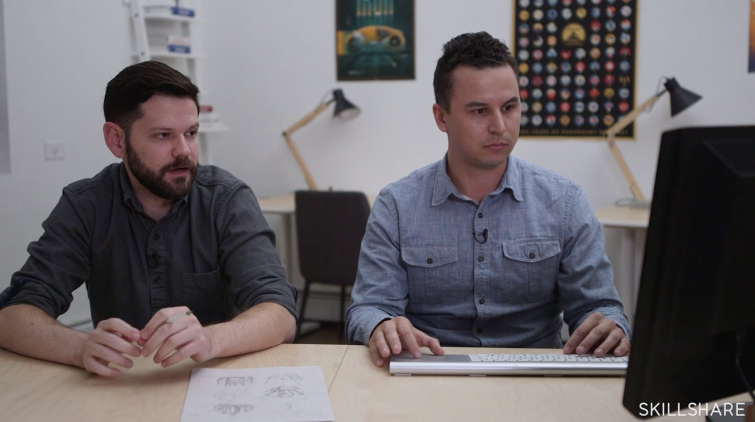
Dan Kuhlken does the heavy lifting in this class, creating three film-related icons but Nathan Goldman chimes in a fair amount with some good insights. Bonus: his voice kinda reminds me of a Will Forte character and it kinda made me look forward to his input. Also, I was a bit surprised that Dan prefers to use a trackpad for this kind of work. Do a lot of you use trackpads in illustrator? I can’t get into it.
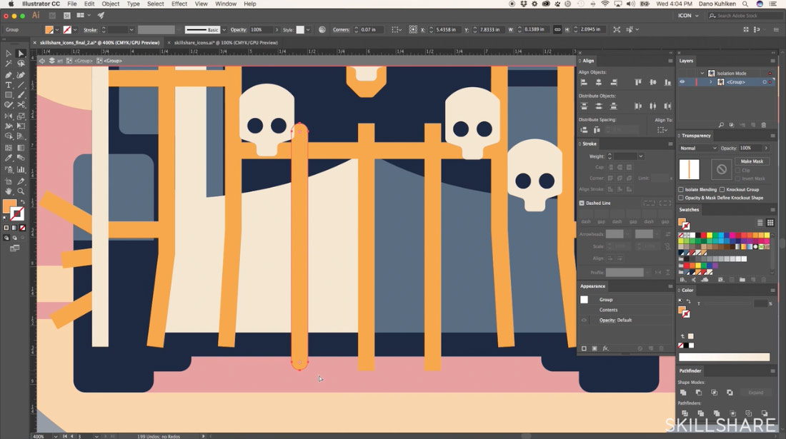
Prior to taking this class I never understood how or why people used multiple art boards, and I was unaware you could turn shapes into guides (Lesson 3) or use global color to update every instance of a color in your document (Lesson 4). All of these things are super useful and the global color thing specifically could have saved me hours of work on pretty much every project I’ve ever worked on.
Having completed several classes now, I think there should be an overlay (that can be toggled on and off) dedicated to all the hot keys the teachers use. Many of them pop up on screen but not enough in my opinion. You can figure out most of them with a quick Google search it just kinda breaks the flow.

I created the image above based off the film poster for Dunkirk. It’s not finished yet, and it still feels a bit different from the icons they created below. I definitely need to introduce white somewhere, clean up the landscape stuff, and probably add some thin straight line details but it’s getting there.
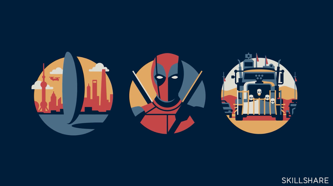
The class ends with some tips on finals tweaks like using off-white instead of pure white to make things feel a little more custom (rounding corners also helps). Overall it’s another really great class, and I learned a lot of things that will now become part of my regular workflow.
If you have any specific questions about the class feel free to a comment or send a tweet. You can watch the trailer for the class below, and if you’re interested in trying out Skillshare we have a special deal for our readers to try 2 months of Skillshare Premium for free!
