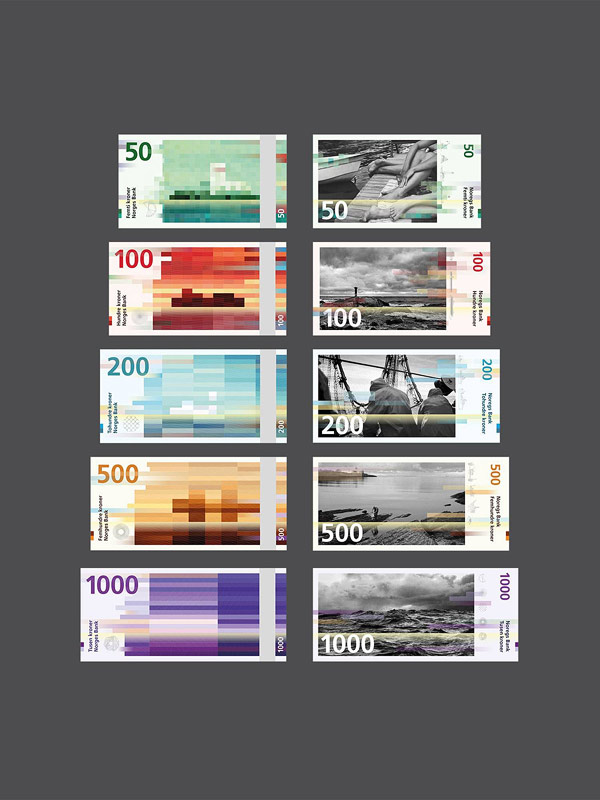
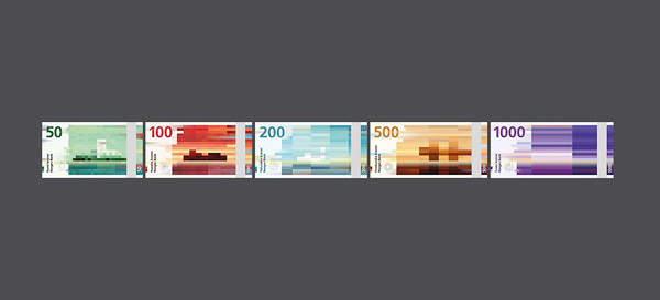
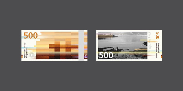
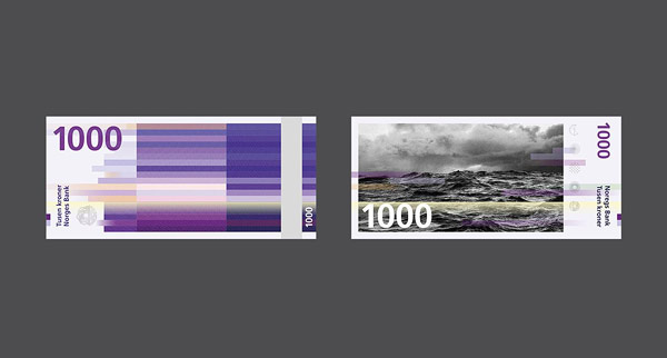
 Architecture firm Snøhetta’s design submission.
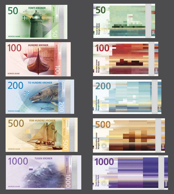
Norway’s currency just got a beautiful makeover courtesy of Norwegian architecture firm Snøhetta and Norwegian graphic design firm The Metric System. The images you see here are Snøhetta’s designs but the final banknotes feature The Metric System’s designs on the reverse side. Norges Bank asked several firms to submit designs, all of which you can see here.
*Edit – Thanks to Helene Brox for the heads up about all the different designs (the version with the kids’ drawings is her favourite and maybe mine too now).
Snøhetta is the architecture firm currently working on the San Francisco Museum of Modern Art expansion, and the designs they submitted are images of Norway’s coast pixelated according to the Beaufort wind scale.
See more of Snøhetta’s designs as well as the final design below.
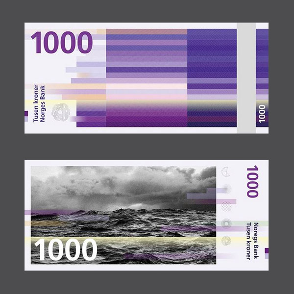
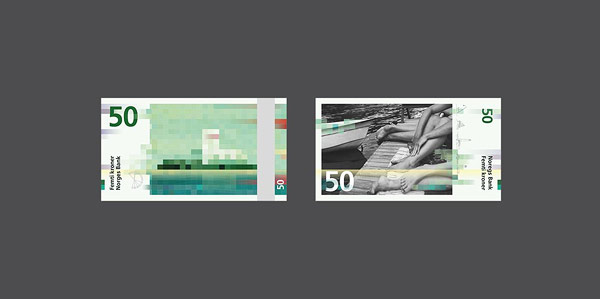
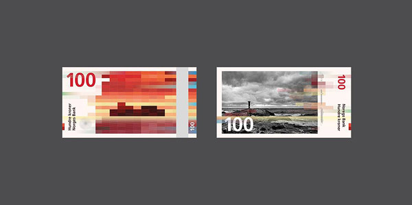
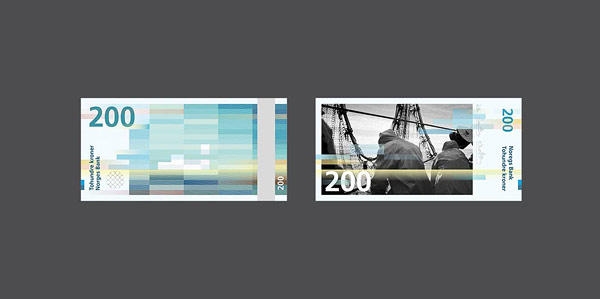
The final currency design features The Metric System’s more traditional design on the front and Snøhetta’s pixelated design on the back:
Via: The Atlantic and Eric Wada
